In a world bursting with vibrant hues and dizzying patterns, minimalist color schemes stand out like a well-tailored suit at a pajama party. They embrace simplicity and sophistication, proving that sometimes less really is more. With just a few carefully chosen shades, they create a serene atmosphere that calms the senses and elevates design.
Imagine walking into a space where colors whisper instead of shout. Minimalist color schemes can transform any environment into a peaceful retreat, making it the perfect backdrop for creativity and focus. Whether it’s a cozy home office or a chic café, these understated palettes invite a sense of tranquility and elegance. So why not ditch the rainbow and explore the beauty of simplicity? Your eyes—and your sanity—will thank you.
Understanding Minimalist Color Schemes
Minimalist color schemes emphasize simplicity and clarity. These carefully curated palettes create visual harmony and evoke a sense of calm.
Definition and Principles
Minimalist color schemes consist of a limited number of colors, often focusing on neutral tones and subtle contrasts. A common principle involves using a monochromatic palette, which includes various shades and tints of a single color. Each color choice prioritizes functionality and emotional impact, making spaces feel more open. These schemes often eliminate unnecessary complexity, fostering a tranquil environment. By balancing light and dark shades, designs achieve depth without overwhelming the senses.
Importance in Design
Designers highly value minimalist color schemes for their aesthetic qualities. Such schemes create visual clarity, allowing key elements to stand out. These colors enhance spatial perception, making rooms appear larger and more inviting. Minimalist color palettes support sustainable design practices by encouraging fewer materials and less visual clutter. Spaces that embrace minimalist colors often promote focus and creativity, contributing to overall well-being. This emphasis on simplicity aligns with contemporary design trends, making minimalist schemes increasingly relevant.
Popular Minimalist Color Schemes
Minimalist color schemes often focus on creating a harmonious and calming visual experience. Here are some popular choices that embody simplicity and elegance.
Monochromatic
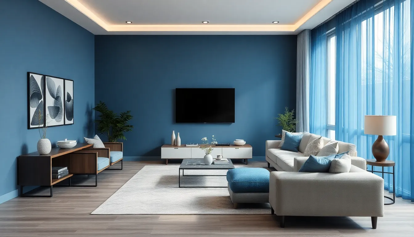
Monochromatic schemes use variations of a single hue. This approach evokes a cohesive atmosphere throughout a space. Different shades, tints, and tones can enhance visual depth without overwhelming the senses. For instance, varying intensities of blue may provide a serene environment, perfect for relaxation. Monochromatic designs also allow for the inclusion of texture through materials, creating interest with minimal distractions.
Duotone
Duotone color schemes incorporate two contrasting colors. This pairing typically blends cool and warm shades, such as navy blue and soft peach. Such combinations create striking visuals that maintain a minimalist feel. Duotone designs enhance focal points and guide the viewer’s eye throughout the space. Designers often choose complementary colors that balance warm and cool tones, leveraging their contrasting yet harmonious nature.
Neutral Tones
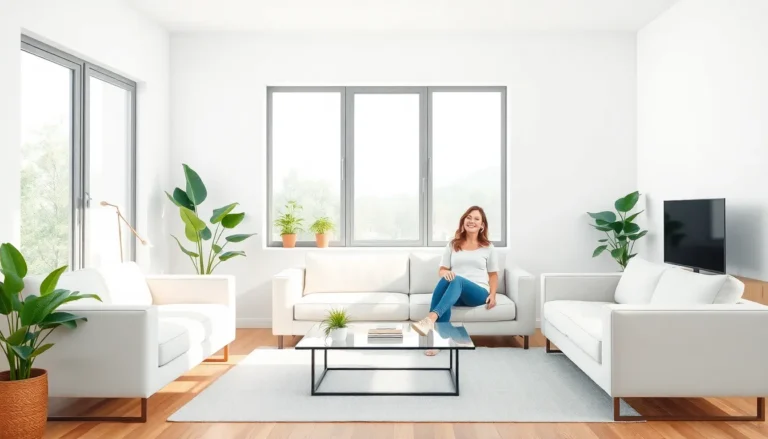
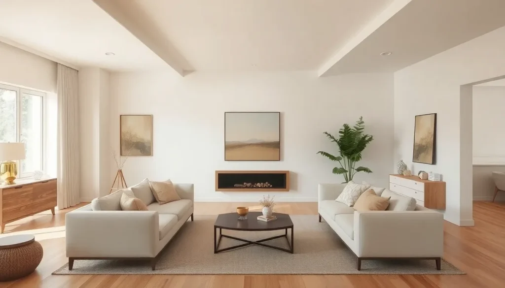
Neutral tones remain a staple in minimalist design. Colors like beige, gray, and white define this palette, promoting a peaceful and inviting atmosphere. These tones act as a backdrop for furnishings and decor, allowing them to stand out without clashing. Neutrals also enhance spatial perception by making areas feel larger and brighter. Incorporating accents of earthy tones deepens visual appeal while maintaining clarity and simplicity.
Benefits of Minimalist Color Schemes
Minimalist color schemes offer significant advantages in design and space usability. They foster environments that are both aesthetically pleasing and psychologically conducive.
Visual Clarity
Visual clarity emerges as a primary benefit of minimalist color schemes. By using a limited color range, these schemes eliminate distractions, allowing for quick comprehension of design elements. Clear lines and soft contrasts create a calm atmosphere, making it easy for viewers to process visual information. Spaces feel more organized when colors do not compete for attention. This clarity empowers individuals to focus on important details rather than get lost in a cacophony of hues. Effective minimalist palettes enhance overall perception, leading to a more engaging and immersive experience.
Enhanced User Experience
Enhanced user experience stands out through the application of minimalist color schemes. Such designs guide users intuitively through spaces or interfaces, fostering seamless interaction. When colors harmonize, users feel more at ease and less overwhelmed. This emotional comfort boosts user satisfaction, encouraging longer engagement. Functionality becomes central as minimalism prioritizes usability without sacrificing aesthetics. By simplifying visual elements, these schemes help create environments that support creativity, productivity, and relaxation, making spaces truly inviting.
Tips for Implementing Minimalist Color Schemes
Implementing minimalist color schemes enhances design simplicity and clarity. Following certain tips can help achieve a harmonious look.
Choosing the Right Colors
Identify colors that reflect intended emotions and functions. Neutral tones like white, gray, and beige often provide a calm backdrop. Consider one or two accent colors to add depth without overwhelming the space. Shades from the same color family create unity and balance. Test colors in different lighting conditions to ensure accurate perception, as light can alter appearances. Gathering samples for comparison supports informed decisions while minimizing regrets.
Balancing Color and Space
Integrate colors thoughtfully to maintain a sense of openness. Using lighter shades can make small areas appear larger and airy. Position darker colors strategically to define specific zones without crowding the space. Allow sufficient negative space around color elements to promote clarity and focus. Ensure that each color choice contributes to the overall design theme, enhancing rather than detracting from the serenity of minimalist aesthetics. Rely on visual harmony to guide color placement, resulting in cohesive, inviting environments.
Embracing minimalist color schemes offers a pathway to creating serene and inviting spaces. By prioritizing simplicity and clarity through a limited color palette, individuals can transform their environments into havens of focus and creativity. The strategic use of neutral tones and subtle contrasts not only enhances visual harmony but also promotes emotional well-being.
As design trends continue to evolve, the appeal of minimalist aesthetics remains strong. Implementing these principles can lead to more engaging and satisfying experiences in any setting. Ultimately, minimalist color schemes are not just about aesthetics; they’re about fostering a sense of calm and clarity that resonates with modern living.